Another Day, Another KEV Viz
How I became a KEV Influencer
Not one day has gone by without a new KEV visualization hitting the Infosec feeds. My LinkedIn is flooded by all sorts of security experts pitching their latest insight neatly packed into sophisticated charts.
The latest wave of visualizations was in response to the CISA announcement that they’ve identified vulnerabilities used in ransomware campaigns. And you would not believe the amount of charts that a single boolean field has generated. I decided to spend some time reviewing some of my favorite visualizations that I’ve come across.
Note to the reader: I’ve generated the charts in this post myself and not linked the original posts to protect the “experts”.
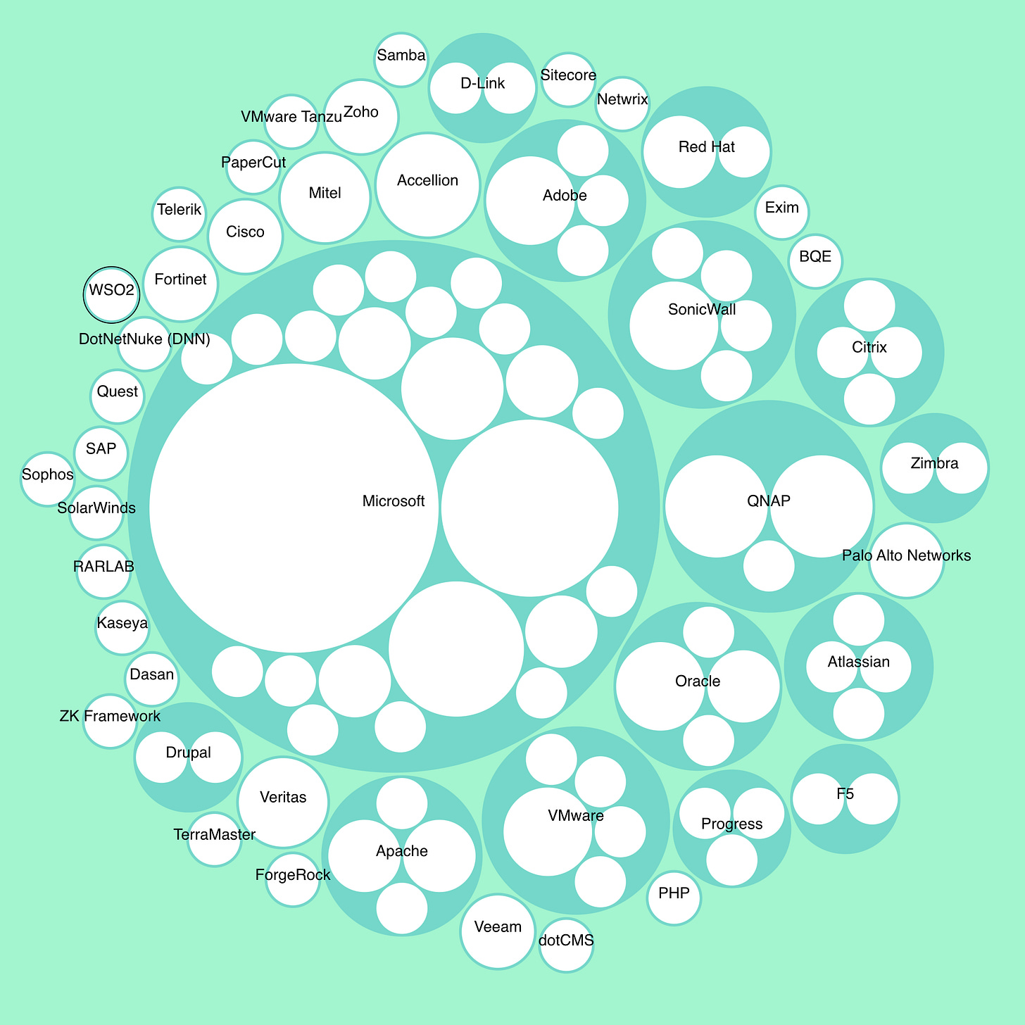
You gotta have bubbles.
This fancy chart is called Circle Packing and shows how many products for each vendor have been known to be used in ransomware campaigns.
As I avidly click each and every circle, I find myself filled with the wisdom and confidence of the mighty cyber security experts. I reach the only possible conclusion and the morning after I email the article to my CTO and demand we abandon all vendors.
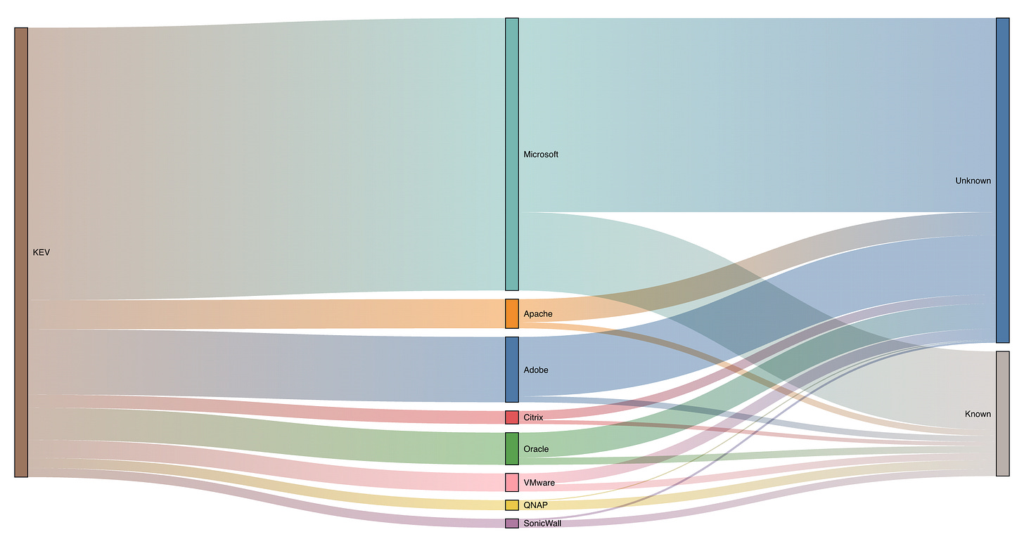
Go with the flow.
This is perhaps the best chart (Sankey) to stare at on a Monday morning to ease back into work. Pour yourself a cup of coffee, pick a side, and start following those colorful flows. Top to bottom, left to right and right to left. Don’t you feel more relaxed already ?
You might think that this chart provides you with no insight, that it points to the obvious conclusion that only a portion of overall KEV vulnerabilities are used in ransomware campaigns. You might even think that it’s an exercise in pointless visualization. You couldn’t be more right.
I want to be a KEV influencer too!
You too want to influence the vast cyber masses on LinkedIn and get showered by praise and the much coveted insight emojis.
Fear not! The key concept to grasp is that you must convince yourself that no content is mundane. When presented into a colorful eye-catching visualization, even the most ordinary information becomes remarkably insightful.
Accompany your charts with short but profound statements:
You must patch your systems.
The sooner you patch the better.
All software has or will have vulnerabilities.
Inexplicably, certain vulnerabilities will be exploited by ransomware gangs.
Remind your readers that context is everything and KEV is only one single dataset. Do not fall into the trap of offering the aforementioned context or enrich the dataset.
Point out that every type of technology is affected and so you have to patch.
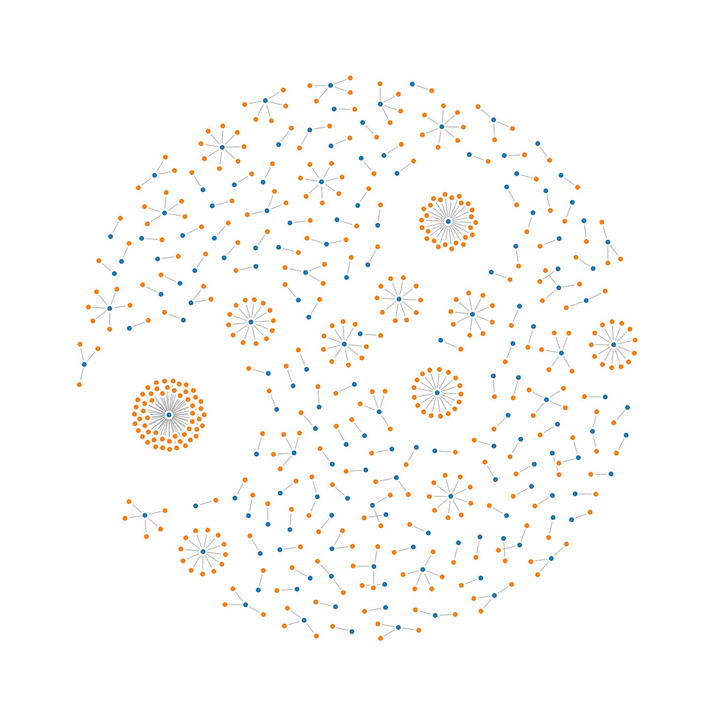
To start, pick a visualization type, content is secondary and will come after. Here are some sources of inspiration, the more catchy and colorful it is, the better. After that you need to transform the data to fit into whatever format the visualization expects and voilà!
I call this one Force-directed Fireworks Vulnerability Graph™
Few notes:
It’s fine to delete and adjust the data that doesn’t make the chart look pretty. Visual impact comes above all else.
Labels and other contextual data is not relevant.
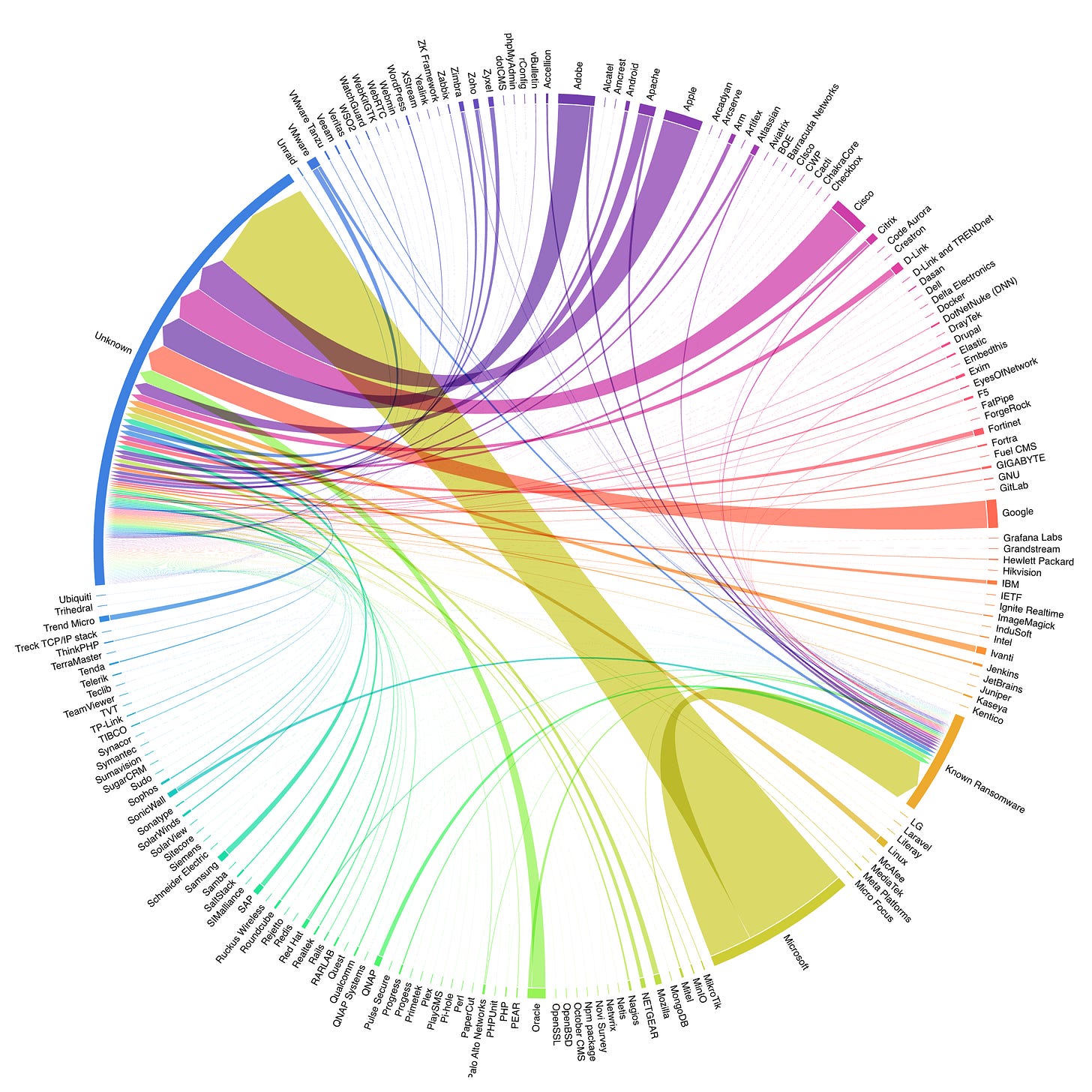
We can do better, so let’s pick another chart. More colorful this time! The Chord diagram is a timeless classic to showcase any type of data when you really want that wow factor in your LinkedIn posts.
This is it for now. Go and and claim your seat as top influencer among the hoards of KEV illiterates out there!


